For modern businesses, the website is the most critical marketing and sales asset.
And the most important page on the website is the homepage. It’s the page that gets the most traffic. As such, it’s important for you to put some thoughts into how you design, message, and structure the homepage so that it delivers a great first impression and communicates your product positioning and value proposition.
If your homepage is done well, you have a great chance of building trust and converting your visitors into leads.
If the homepage is poorly done, visitors are more likely to bounce and not explore your website further.
In this article, I will share some homepage design principles and tips to help you build an effective homepage.
What should be Included on the Home Page
The purpose of the homepage is to:
- State your product positioning by communicating what it is that you do, what problems you solve, and who is the ideal client for your product/service
- Describe the benefits, results, or transformation your ideal client will get, and why your solution is different and better than the competition or current solution
- Build trust and credibility for your business by showing social proof elements like customer logos and testimonials
- Let visitors know what are the desired actions you want them to take – What is the primary action you want people to take on your website? Depending on your business, it could be “request a demo”, “start a free trial”, “get a free consultation”. This would be your main CTA.
- Get visitors to consume your content if they are not ready for the main action you want them to take. You might want them to read your blog articles, subscribe to your newsletter, or download an ebook.
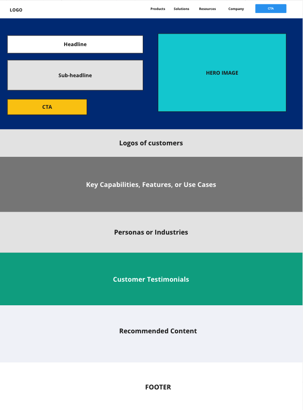
Your homepage should include all or most of the above elements and information. Next, you need to think about how to lay out and organize the content on your homepage.
Below is a wireframe of a homepage layout that you can adopt. It includes the major sections that most effective homepage uses.
The hero section – How to build an effective hero section
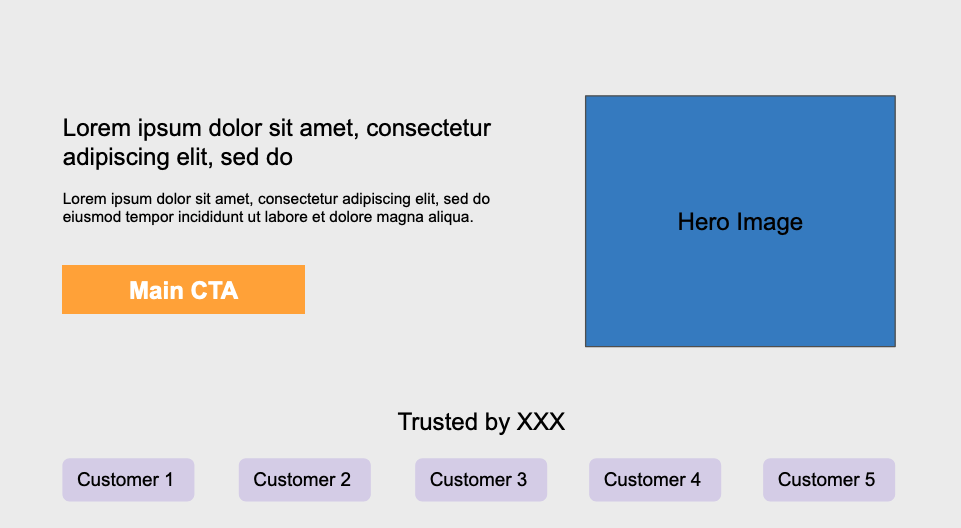
Within the first 5 seconds, the hero section should quickly convey to website visitors what exactly that you do and how you can help your ideal customer. If they don’t understand what you do right away or if they have a bad first impression, they may bounce.
The hero section should have these important elements:
The Title and subtitle
The H1 Title and subtitle together should convey what it is that you do, what problem you solve, who is your ideal client, and what benefits or positive outcomes they can expect by using your product or service.
If applicable, you should also mention your product category (i.e. sales outreach app, project management app, etc) and your ideal client (i.e. for sales team, IT leaders at a security company, for sales leaders, for HR leaders, for accountants, for data engineers at large enterprises, etc) .
If your business is a startup, your messaging shouldn’t be too broad or vague in terms of the use cases or the personas you’re trying to target. So it’s important to be as specific as necessary in terms of who is your ideal client and the one major pain point or problem you help to solve.
Here are some examples of effective titles and subtitles for the hero section:
Example #1: Calendly
H1 Headline: Easy scheduling ahead
Sub-headline: Calendly is your scheduling automation platform for eliminating the back-and-forth emails to find the perfect time — and so much more.
Example #2: Navattic.com
H1 Headline: Create Interactive Product Demos
Sub-headline: Self-guided demos that look and feel like your software. Add to your website in a matter of clicks.
Example #3: Basecamp
H1 Headline: Refreshingly simple project management.
Sub-headline: Your team deserves less. Ditch the ineffective “stuff scattered everywhere” approach, and switch to Basecamp’s all-in-one project management platform.
The Hero Image
For the hero image, you can show your customer interacting with your product or expressing satisfaction from the results delivered by your product. Additionally, you can also just show an image of the product or product UI (for software products).
The image you select should look professional and should be relevant to your business. A custom designed image is always better than a stock image.
The main CTA
The main CTA (Call to action) tells visitors the expected action you want them to take. Depending on your business, it could be “Start your free trial”, “request a demo”, “Request a meeting”.
The main CTA should appear in the form of a button and should use a color that makes the button stands out.
Trust Indicators
If you already have some recognizable brands as your early customers, you may proudly display their logos in the hero section. This is a great way to establish credibility and build trust with your site visitors. However, if you don’t have any recognizable customers, it’s not necessary to show your customer logos here.
What goes after the hero section?
Assuming that you did a good job with the hero section, what comes after determines whether or not people want to explore your site further.
Here are the different variations of content you may consider, with each of these deserving its own separate section. You may have one or more of the below content right after the hero section.
- Key features – If your product is in a mature product category, then discussing the key features here makes perfect sense. Don’t list more than three key features here though. Just focus on the 2-3 key features and you can list out the rest of the features on the product page.
- Overview of services – If you are a service provider, provide an overview of the main services you offer here.
- Use cases – If you have a product that can be used to solve multiple problems, then you should list out the key use cases here. For each use case, mention the key capabilities and the results that they deliver. Alternatively, if your product is used differently for different personas (i.e. sales director, marketing director, finance director) or different teams (operations, software engineering, IT), then you can just discuss the problems it solve and how it benefits the different persona or team.
- Benefits or results – If your target audience is not too technical or don’t care too much about the technical details, then you can just discuss the key benefits or outcomes that they will receive. Be sure to be as specific as possible. Rather than saying something generic like improve productivity by 50%, something more specific like “reduce time to QA code by 50%”.
- How it works – Sometimes, it might be helpful to show how your product works in a few steps. This is helpful if you are introducing a new method or new way of doing things and you can show how your customers can get the desired outcome or result in a few steps.
- What makes you different – Here, you can summarize using 2-3 bullets what makes your solution different and better than alternative solutions. If necessary, you can link to a separate “Why Us” page where you can provide more details.
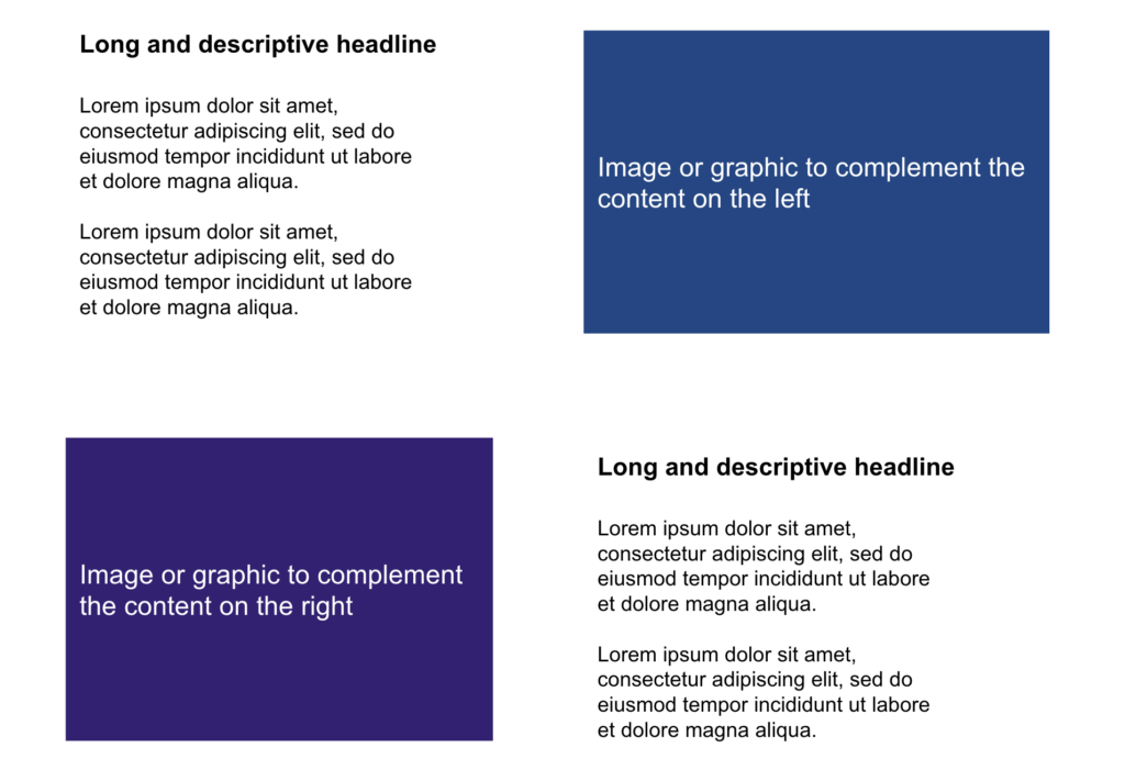
For the layout, you can organize the content in a two or three-column format or a zig zag format where you have the text content on one side and an image on the opposite side.
Two or Three-Column Layout
Zig Zag Layout
The Customer Testimonial Section
You can say lots of great things about your product, but people might not trust you unless they see other people have a positive experience with using your product.
Adding customer testimonials to your homepage is a great way to build trust and credibility. It makes buying your product less risky for potential customers. When you ask a customer to provide you with a testimonial, make sure that what they say is specific and ties in to the benefits or results that they got from using your product.
The Recommended Content Section
For visitors that are not ready to engage with your sales team or start a free trial, you might want to offer them your best content. These could be an ebook, a guide, a recorded webinar, or blog articles that can help your visitors learn more about the technology, your unique approach to solving the problems that are relevant to your target audience, or how your solution is better than the competition.
Final Thoughts
You probably will not create the “perfect” home page on your first attempt. But by following this guide, it gives you a good start. To improve your homepage further, you can ask for feedback from customers or prospects. You may also use website analytics tools like Hotjar or Google Analytics to give you insights to make necessary changes/improvements.


