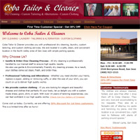
 The first important step in marketing your business on the Internet and raising your visibility to your prospects is to have a website.
Yet, to my dismay, lots of small businesses out there don’t even have a website!
So if you are a small business owners and you don’t already have a website, go get one now! Your business survival depends on it! In case you don’t already know, the Yellow Pages and traditional ways of doing marketing are ineffective and becoming obsolete.
If you don’t have time to build your own website, you can hire a designer on Craigslist, Elance.com or you can use the SmallBiz WordPress Theme template.
The SmallBiz WordPress Theme template is a great option if you want to quickly and easily build a professional looking website that is optimized for the Search Engines. It leverages the WordPress content management system so that you can easily add content and make updates/changes to your site easily by yourself. And the great thing about it is that you don’t need to do any programming or geeky stuffs by yourself.
Now, if you want to learn how to make a great website, then read on…
Elements of a Bad Website
A lot of people are still fascinated with fancy looking websites with lots of graphics and animations. Let me warn you – A successful and great website has nothing to do with having lots of graphics or animations.
In fact, having lots of graphics and animations can hurt your website performance in many ways. For one, it slows down the loading time. Secondly, it adds lots of clutter and distract the visitors from digesting the main messages.
What is a great website for Small Businesses?
I define a great website as being attractive, professional looking, simple and clean, and achieve its goals and objectives.
The last words are especially important. You must have goals and objectives for your website!
Your goals and objectives should include making a good impression on your visitors and providing them with necessary and adequate information about your business, products, or services. Additionally, your website must be able to build trust and establish your credibility.
Elements of a Great Small Business Website
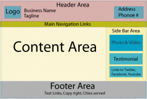
As seen in the figure below, the main components of a website are the header, the navigation links, the sidebar, the content area, and the footer area.

The header area – The header area should contain the Logo, the business name, and business tag line that captures your business’ value proposition. Additionally, you can provide your business’ address and phone number on the far right.
- Make sure you have a professional looking logo that best represents your business’ image. A professional looking logo represents your brand and it’s important for your business’ credibility! A logo doesn’t have to be fancy. But it should be simple and memorable, using a combination of colors, symbols, typography, and graphics that best portray your brand image. You could create a great logo using only texts. However, you should use a high quality font! Consider using the service of a professional logo designer (on Craigslist or Elance) to create a logo for you. If you want to go with a cheaper option, you could also try the “Do it Yourself” logo design services from LogoDesignPros or Logoworks.
- Tagline – Having a tagline is optional. A tagline is a memorable, catchy short phrase that conveys the benefits or value proposition of your business.
The Navigation Bar– Links to the different pages of your website should be here. The elements in a navigation bar usually include links to “home”, “products”, “services”, “resources”, “about us”, and “contact us.”
The Right Side Bar – On the right side bar, you could include photos, videos, testimonials, endorsements from 3rd parties, seals/certificates, links to your Facebook, YouTube, and twitter accounts, and other secondary links.
Content Area – The content area is where you write the content for each specific page. Be sure to incorporate your keywords in the body of the content as well as in the <h1>, <h2> heading HTML tags.
Footer Area – On the footer areas, you can include information such as copyright, text links to other pages of your site, the cities that your business serve, and disclaimers, privacy policy, etc.
To make your site look professional, trust worthy, and attractive, make sure you follow these design guidelines:
- Use professional looking photos and graphics – The photos and images of you, your store, or your products should be of high quality and crisp. Crop if necessary. Also, refrain from using cheesy looking stock images/photos. Instead, take your own photos and let your visitors see your real personality.
- Use a clean layout with adequate white space – Don’t try to clutter the webpage by jamming everything into it. The look and feel of your site should be clean and focused. Eliminate anything that is not relevant or contribute to conveying your value proposition or business information.
- Make your web copy scannable – People don’t read online. They scan! So make your content digestible by having short paragraphs, lots of bullets to communicate benefits and features, and lots of subheadings that are bolded.
- Use clear, conversational, simple, and lively words and languages – The purpose of your website is to clearly and succintly provide information about your business and services. Avoid fancy jargons, boring, corporate languages, and long, complicated sentences.
- Use color scheme that is appropriate for your brand – Start with the colors of your logo and refer to the colourlovers.com site to get ideas on color palettes. In general, use no more than 4 colors!
- Use easy to read fonts – Although there lots of fancy fonts to choose from, you should just stick with basic fonts such as Arial, Georgia, and Helvetica. These fonts make your texts easy to read, which is more important than anything else. Additionally, the font size of your text should be large enough so that people don’t hurt their eyes trying to read your content. Font size of 14px is recommended.
- Maintain proper contrast between text color and background color – The colors you pick for your text and background color should show have some level of contrast. The contrast should be subtle and pleasing to the eyes rather than jarring to the eyes though. A white or light grey background with black text is usually a safe option.
- Keep your website width at 960 pixels and centered – 960 pixel width is the standard web site width for a 2-3 columns layout design. If you have a simple website with just 1 column layout, you can opt for a website width of 800 pixels. Be sure your site is centered on the screen. I still see some sights that are left centered. Today, most of the users have a large screen monitor. If your site is left centered, the users would have to constantly turn their neck and their eyes to the left!
The above proven web design principles are the foundation for creating a professional website for your business. By following the above guidelines, you will create a site that earns visitors’ trust and praise. Again, if you don’t have time to build your own website, you can hire a designer on Craigslist or you can use the SmallBiz WordPress Theme template to quickly and easily build your site.
Please read the post, “Features of a Great Small Business Website” to learn about what information to put on your website to make your visitors like you, trust you, and want to do business with you.

This is all good information. Something everyone should read building a first website.
A right side bar is preferred for marketing sites with a subscriber form placed close to the top. In newspaper terms “above the fold”.